Here are technical tips on how to create powerful PowerPoint presentations.

Before you even get to the PowerPoint, you need to start with these three steps:
Be completely clear on what your message is. What do you want your audience to know, and at the end – how should they respond?
Understand your audience – who are they, and how do they like to receive their information? For example, if you’re presenting to scientists, including graphs and data is key.
First, write out your content in a Word or Google doc. Then map out your presentation – from the first slide to the finish and think about what content goes on each slide. Remember that not all your points need a slide. Sometimes one powerful photo can represent 50% of your content. Practice your pace, then write out the key phrases on your slides and refine them.
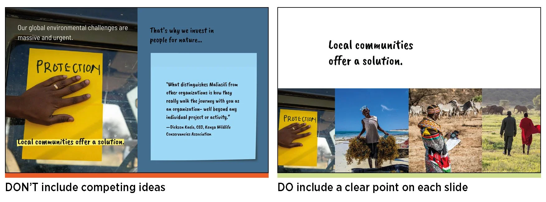
Do not try to squeeze too many elements into one slide. It’s overwhelming and distracting. The best practice is to have no more than two elements on one slide.

Every slide should share a clear idea, and its content should speak to that point.
As you present, your slides should complement your key talking points. Consider these six storytelling elements and ask yourself – what visual backup do I need?
INFORM: Present a fact, figure, or number in a large font.
EDUCATE: Include a graph, map, or a simple infographic.
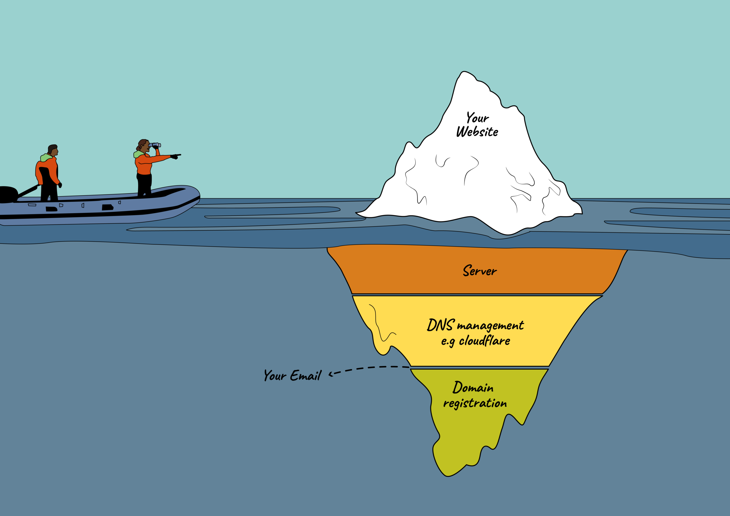
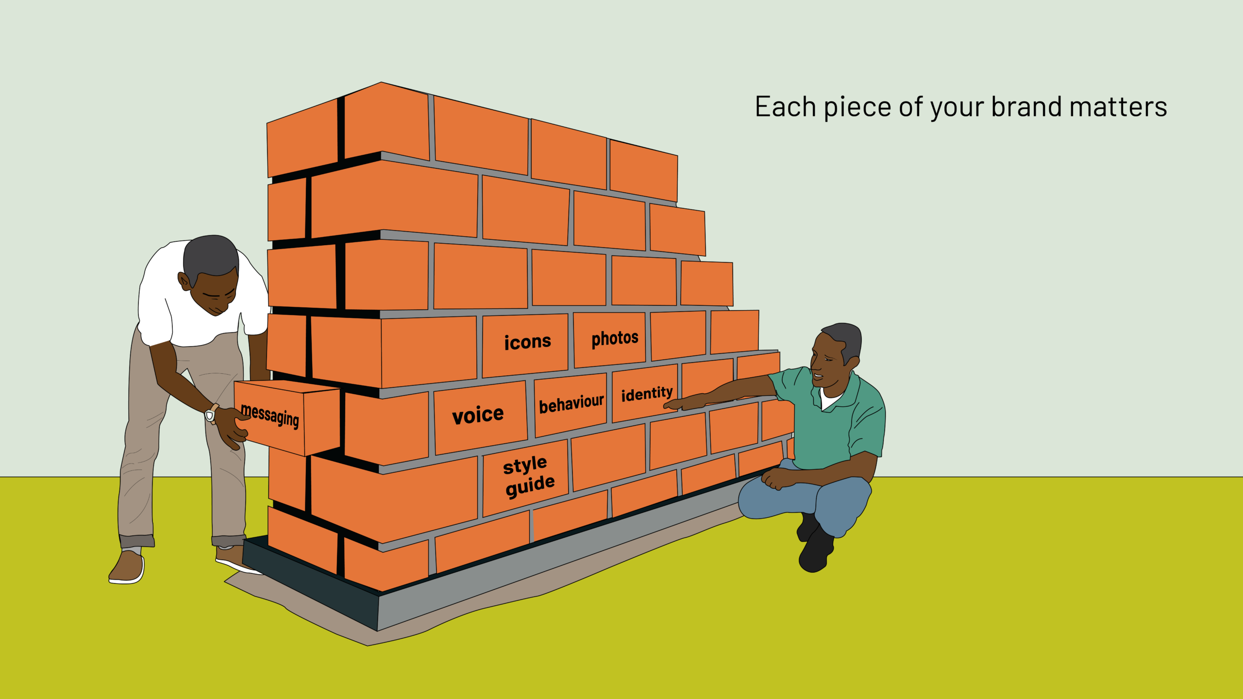
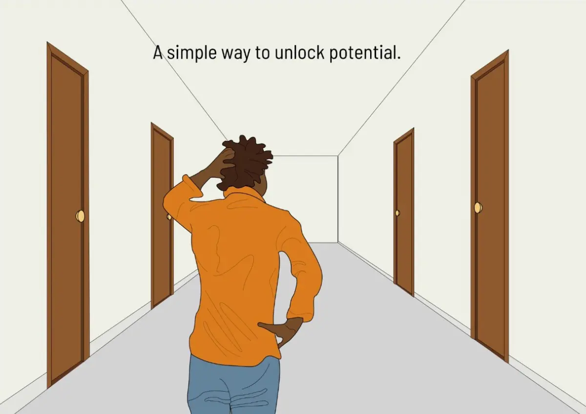
INSPIRE: Use powerful photography or illustrations.
ENTERTAIN: Use a meme or a GIF that adds a twist, or brings a moment of pause.
CHALLENGE: Use a quote or simply pose a question.
ENGAGE: Use any of the above to help your audience stay on track with your pace. Keeping your audience engaged with both your presence and your visuals will help them feel included (and keep them awake).
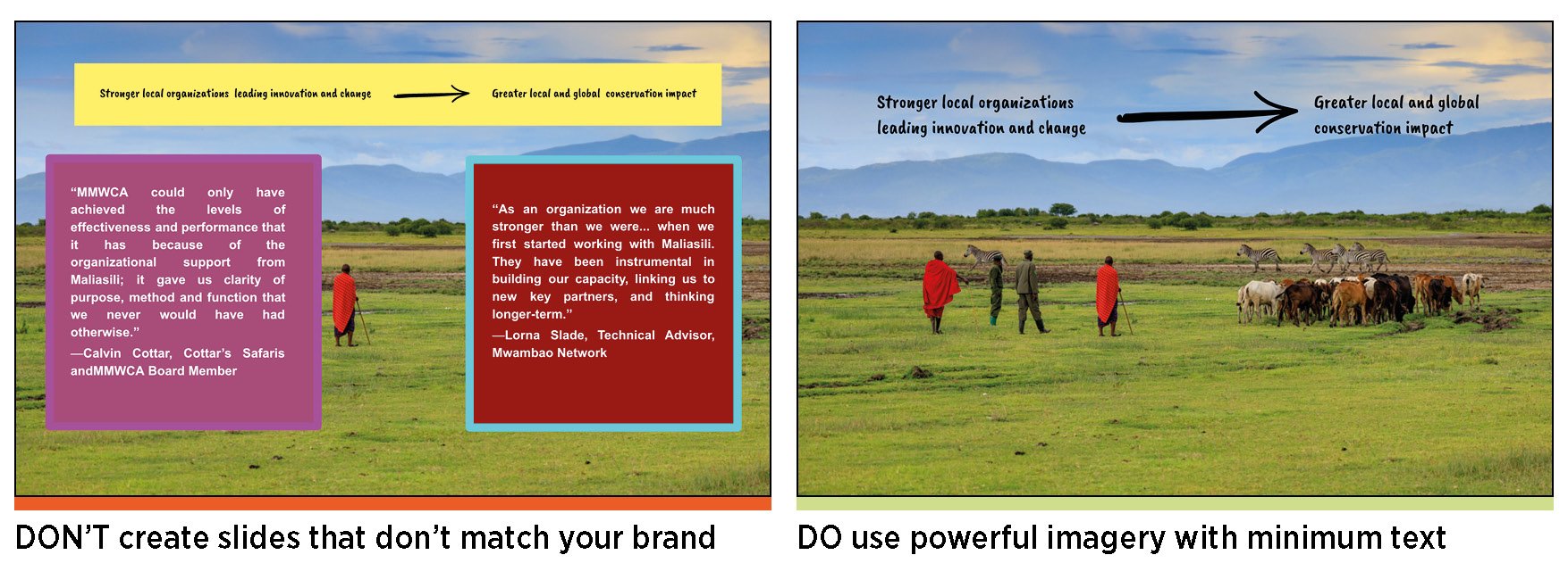
Do not alter the proportions of your visual elements such as images, icons, graphs, logo, etc. to fit on a slide. It makes your presentation look unpolished and unprofessional.

Seriously. Evidence shows that people can’t listen and read at the same time. Aim for no more than 30 words per slide. These words should reinforce your message but should not explain your point – that’s what you’re for.
Even better, don’t have any words and just have an image!
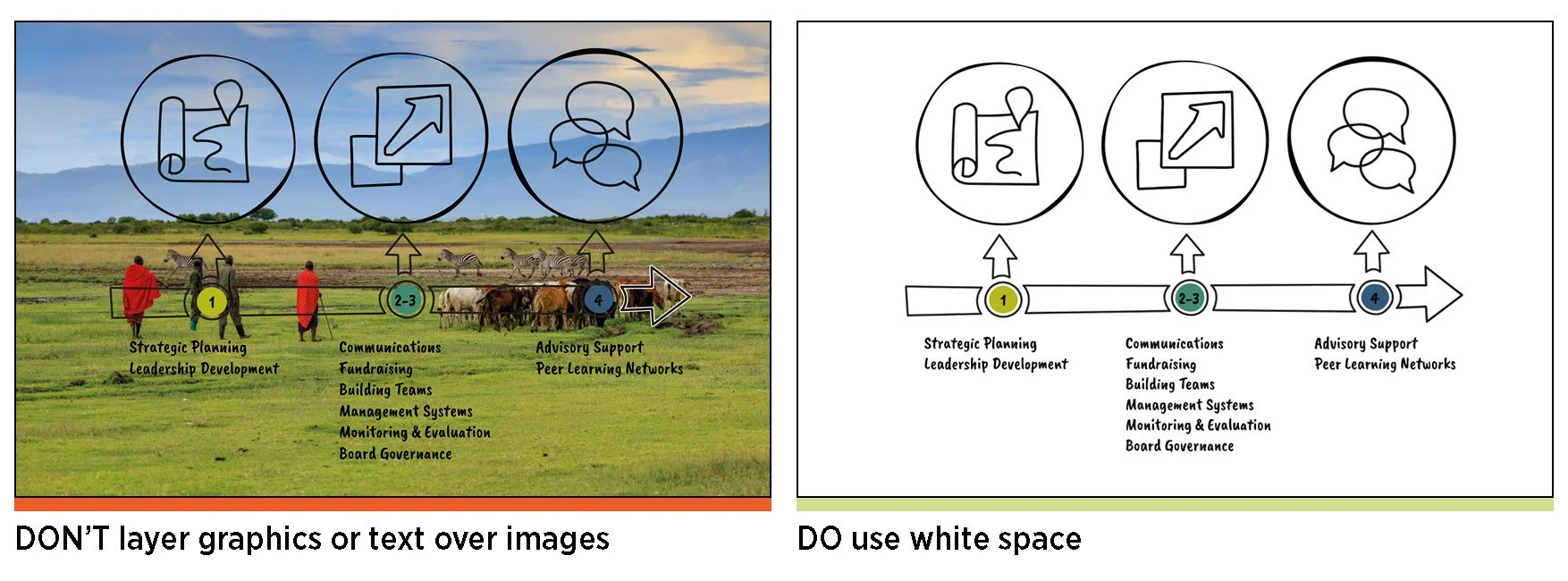
Pick the right font and size. Can your audience read your text? Are your slides crammed with small text and rows of sentences? Is your text over a photo or hard to read? Do not use fonts smaller than 25-point size, and don’t add text over photos.
Pro tip – never read word for word from your slide.

Pro tip: Your first and last slide should be the strongest. This is because you need a captivating introduction to draw people in and keep them curious, and you want to end with a strong impression. You’ll know you’re successful when you get positive feedback and engagement.
Go through your presentation several times, ensuring that you’re comfortable with the message on each slide, your presentation has a good flow and is within the allocated time limit. Use the notes section to prompt your presentation – don’t feel the need to put everything on your slide!